Flowstate
Adaptive workflow prototype for moving from mental clutter to meaningful action.
The idea
Flowstate is a place to dump what's on your mind.
It sorts it, then shows you one place to start with as much or as little help as you want.
It adapts task complexity, guidance, and information density to a person's changing cognitive state, helping them move through work with greater clarity while preserving agency.
The approach
Apple Notes is a utility.
A notebook is an invitation. Permission to be messy, no expectation of organization, low stakes.
Flowstate defaults to the notebook: a blank field, no categories, no due dates, no AI. Just "what's on your mind?"
Structure only shows up when it's asked for: one small affordance, not a sidebar of tools.
Structure only shows up when it's asked for: one small affordance, not a sidebar of tools.
The problem
Static tools ask the most of you right when you have the least to give.
.png)
When someone's overwhelmed, the problem is rarely a lack of information. It's not knowing:
- Where to start
- What matters right now
- What to ignore
- What happens next
HOW IT ADAPTS
Flowstate adapts across three dimensions, adjusting its level of support to match a person's changing cognitive state.
01 — Information Density
How much information is shown: The interface reveals only what's needed in the moment. Under high cognitive load, it reduces choices and visual noise. As capacity increases, it gradually introduces more context, planning tools, and flexibility.
02 — Engagement Depth
How much engagement is required: Support evolves as users regain momentum, guiding them through four levels of engagement:
Orient → Act → Reflect → Integrate
03 — Guidance Level
How much support is provided: The experience continuously adjusts how much guidance it provides—from gentle prompts to step-by-step support—while preserving user agency and control.
How much information is shown: The interface reveals only what's needed in the moment. Under high cognitive load, it reduces choices and visual noise. As capacity increases, it gradually introduces more context, planning tools, and flexibility.
02 — Engagement Depth
How much engagement is required: Support evolves as users regain momentum, guiding them through four levels of engagement:
Orient → Act → Reflect → Integrate
03 — Guidance Level
How much support is provided: The experience continuously adjusts how much guidance it provides—from gentle prompts to step-by-step support—while preserving user agency and control.
what mattered most
Adapt without taking control.
The system suggests and guides. It never decides on someone's behalf, protecting attention instead of competing for it.
01 — Context-First Entry
Instead of opening into a dashboard, the experience begins by identifying what kind of support would help — what someone's working through, what matters today.
02 — Adaptive Workspace, Not Full Visibility
Rather than surfacing every task and deadline, the system determines the appropriate level of complexity — often just the next step, not the full project.
03 — Structure Without the Labor
Sorting and prioritizing are planning tasks — the exact thing people lack bandwidth for when overwhelmed. The system carries that load instead of asking the user to categorize their own input.
04 — Micro-Progress Loop
Large actions are broken into immediate, low-friction moments — open the file, add one idea, decide the next step — reducing the gap between intention and action rather than eliminating effort altogether.
Instead of opening into a dashboard, the experience begins by identifying what kind of support would help — what someone's working through, what matters today.
02 — Adaptive Workspace, Not Full Visibility
Rather than surfacing every task and deadline, the system determines the appropriate level of complexity — often just the next step, not the full project.
03 — Structure Without the Labor
Sorting and prioritizing are planning tasks — the exact thing people lack bandwidth for when overwhelmed. The system carries that load instead of asking the user to categorize their own input.
04 — Micro-Progress Loop
Large actions are broken into immediate, low-friction moments — open the file, add one idea, decide the next step — reducing the gap between intention and action rather than eliminating effort altogether.
THE product
Flagship Flow
The prototype demonstrates the capture process, available assistance, and system suggestion.
walking through it
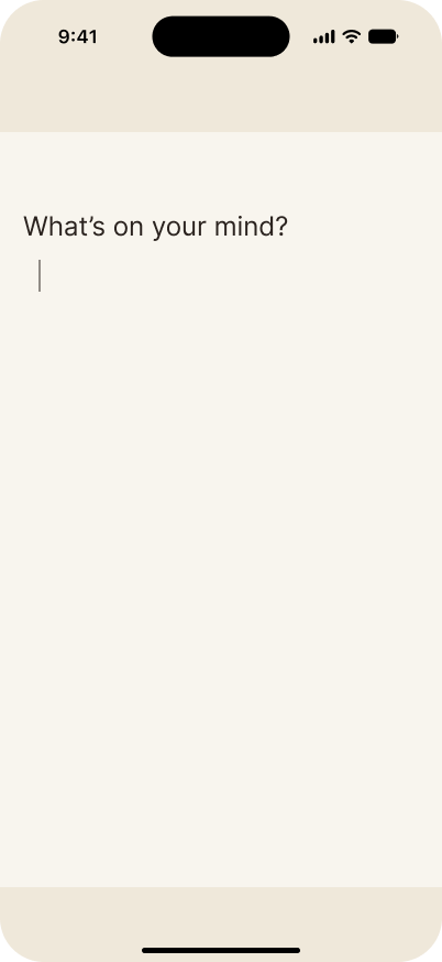
01 — Open space to brain dump
No fields. No categories. Nothing to organize before you've even gotten the thought out.
No fields. No categories. Nothing to organize before you've even gotten the thought out.
02 — Assistance is available
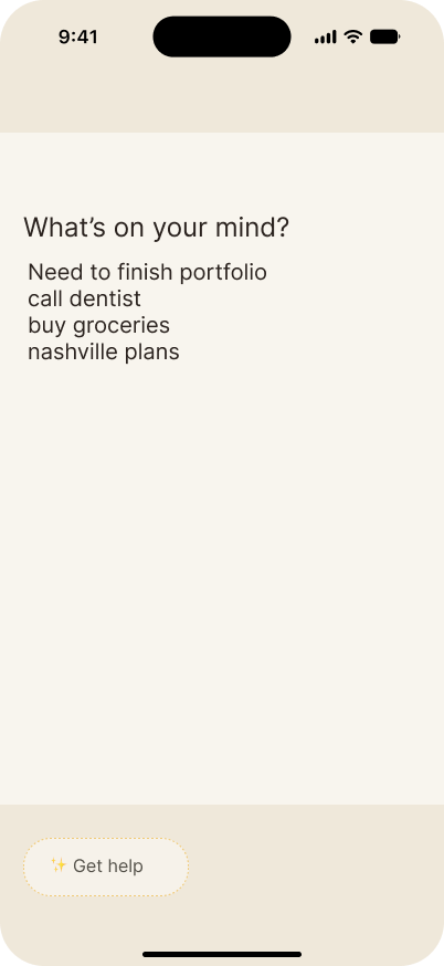
One quiet affordance. Intelligence doesn’t interrupt, it waits to be invited.
One quiet affordance. Intelligence doesn’t interrupt, it waits to be invited.
03 — User opts in
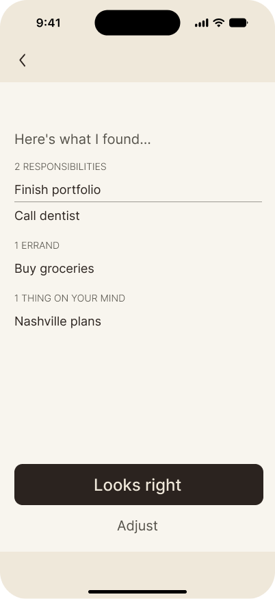
The system reflects back what you dropped in and shows it's interpretation.
The system reflects back what you dropped in and shows it's interpretation.
.png)
04 — System suggest
The user decides if they want to accept, adjust, or leave it alone.
The user decides if they want to accept, adjust, or leave it alone.
05 — Focused direction
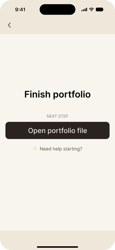
Once a direction is chosen, the interface gets quieter and competing information recedes.
Once a direction is chosen, the interface gets quieter and competing information recedes.
meeting people where they are
Five states. Five responses.
One rule: meet the person where they are.
One rule: meet the person where they are.
.png)
what i learned talking to people
Testing the concept
8 interviews + field observations exploring productivity behaviors, cognitive overload, and trust in adaptive systems.
8 interviews + field observations exploring productivity behaviors, cognitive overload, and trust in adaptive systems.
The structure trap
People knew what to do. Not where to begin.
People knew what to do. Not where to begin.
-> Show less, not more, when someone's overloaded.
Speed beats structure under load
Capture first, organize later. Users confirmed the need for zero-friction capture.
Capture first, organize later. Users confirmed the need for zero-friction capture.
-> Became the blank, field-free entry screen
Help ≠ control
People wanted less complexity, not a system that decides for them.
People wanted less complexity, not a system that decides for them.
-> Became the "get help with this" affordance- present, but never automatic.
Still open
Does opt-in assistance feel supportive or create another layer of friction?
Does opt-in assistance feel supportive or create another layer of friction?
-> Left as an open flag for further testing.
Success would look like:
Fewer abandoned entries mid-task and people re-opening Flowstate to pick up where they left off, not start over.
Fewer abandoned entries mid-task and people re-opening Flowstate to pick up where they left off, not start over.
Reflection
Flowstate doesn't tell people what to do.
It changes what feels possible next.
It changes what feels possible next.
The goal was never to remove thinking, only the friction of navigating the system, so attention goes where it should.